Bullet Chart by OKVIZ, allows you to show and compare different metrics, in a single powerful visual, saving precious space on your reports.

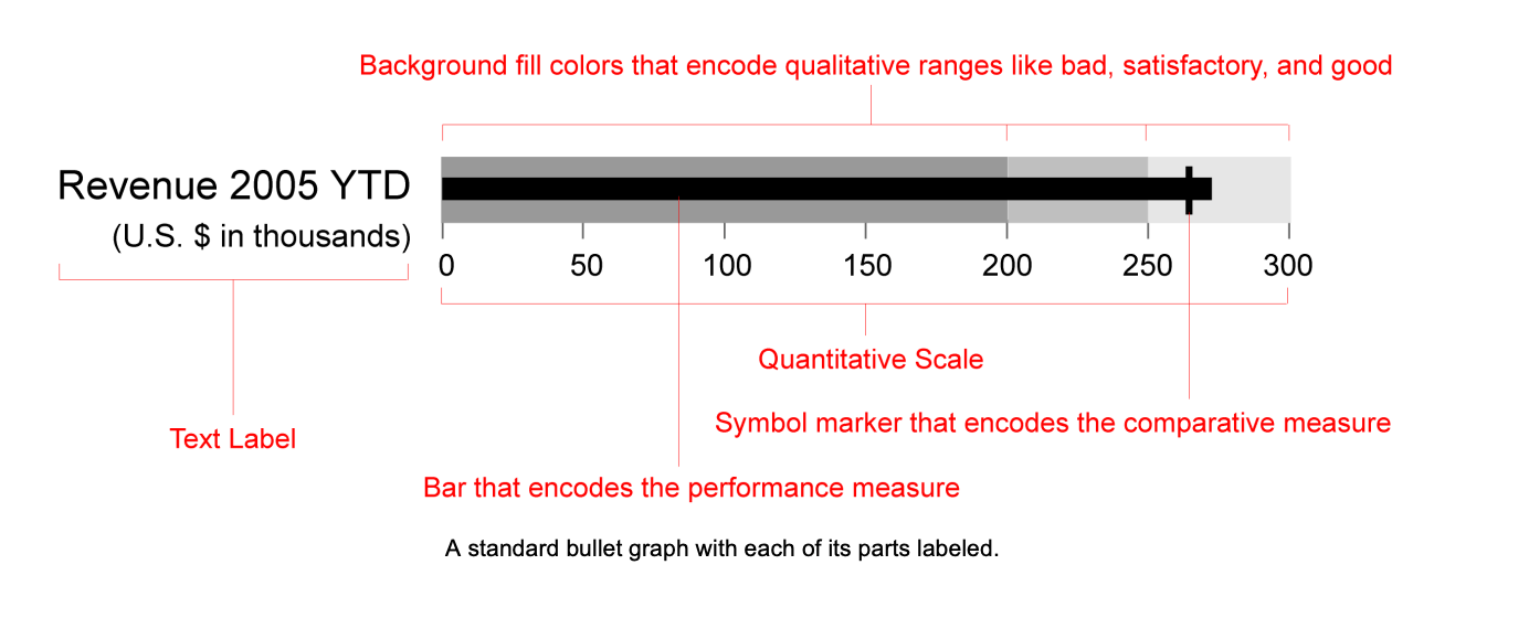
It can render a single primary measure (Value) and compares it to a secondary measure (Comparison Value) and/or multiple other measures (Targets).
To enrich your data-storytelling, measures can be embedded in qualitative performance intervals (States), usually shown as different intensities of a single hue. To highlight the difference between measure and its target, variance bars can be displayed allowing to understand the chart more quickly.
Bullet Chart also allows you to show data labels for all measures and it is highly customizable with many options, allowing to define shapes, colors, spaces, and position for all elements.

